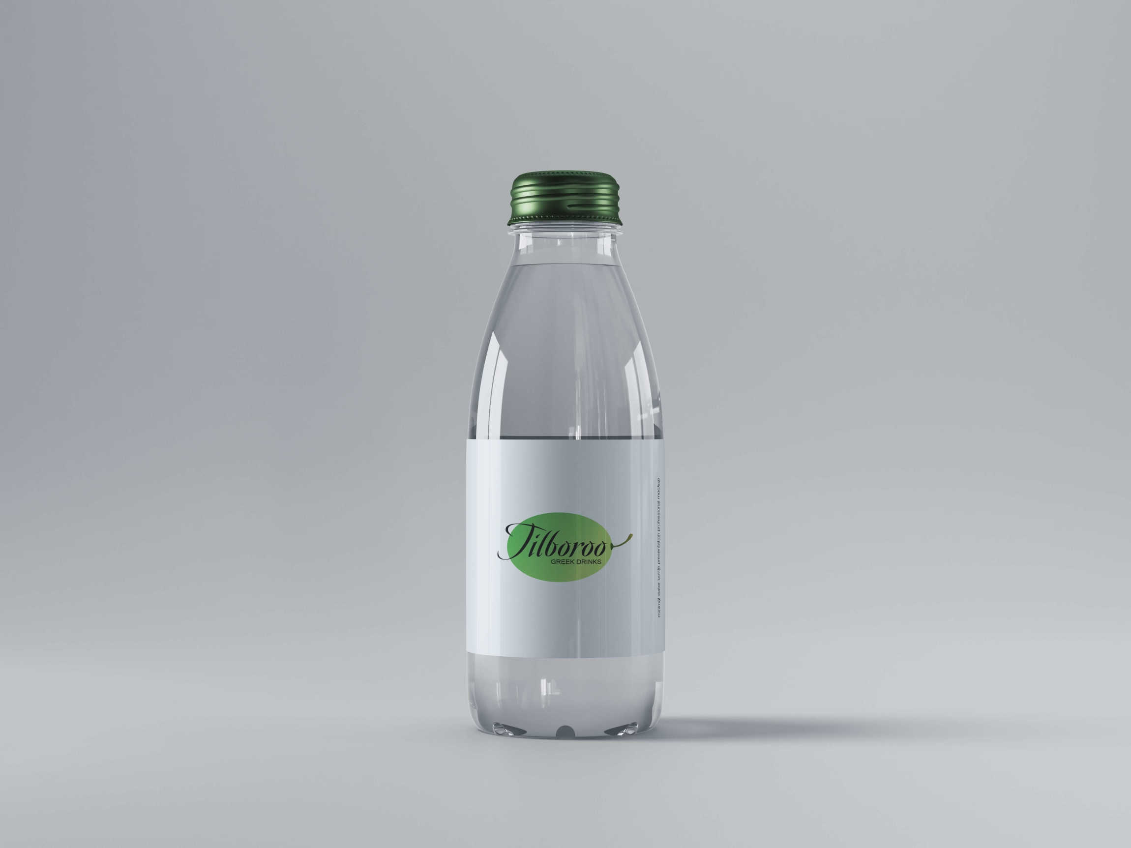
Brand Design
Brand for Tilboroo | 2021
Creation of a new brand identity for a company called Tilboroo.
- Adobe Illustrator
- Adobe Photoshop
- SVG
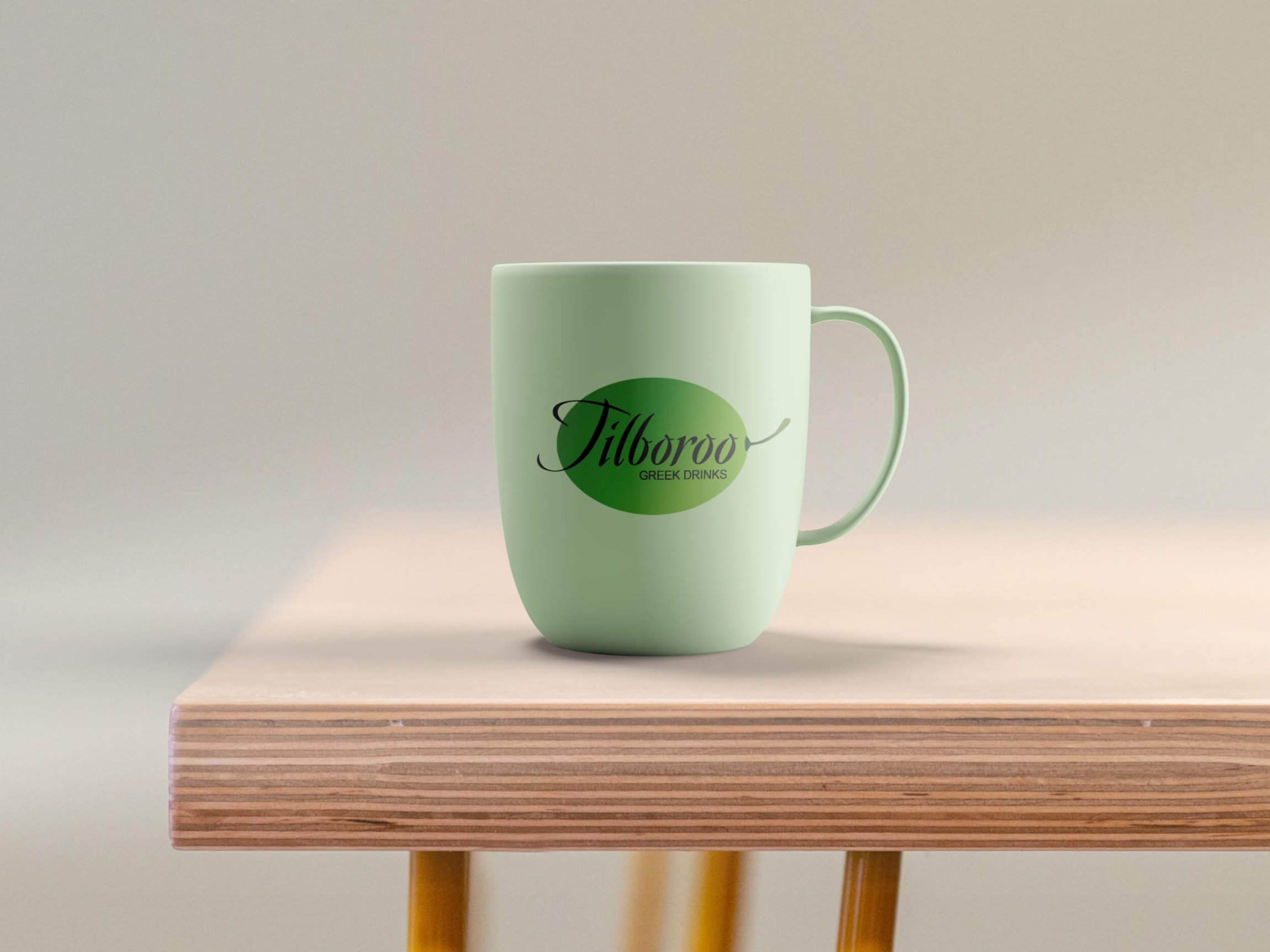
Tilboroo Global:
"We are a company that makes and distributes Greek drinks. Our main product is made with a secret recipe and shipped directly to your home. We want to convey a sense of importance, while at the same time being down-to-earth. Our target audience is married couples. The goal is to make it clear what the company does."
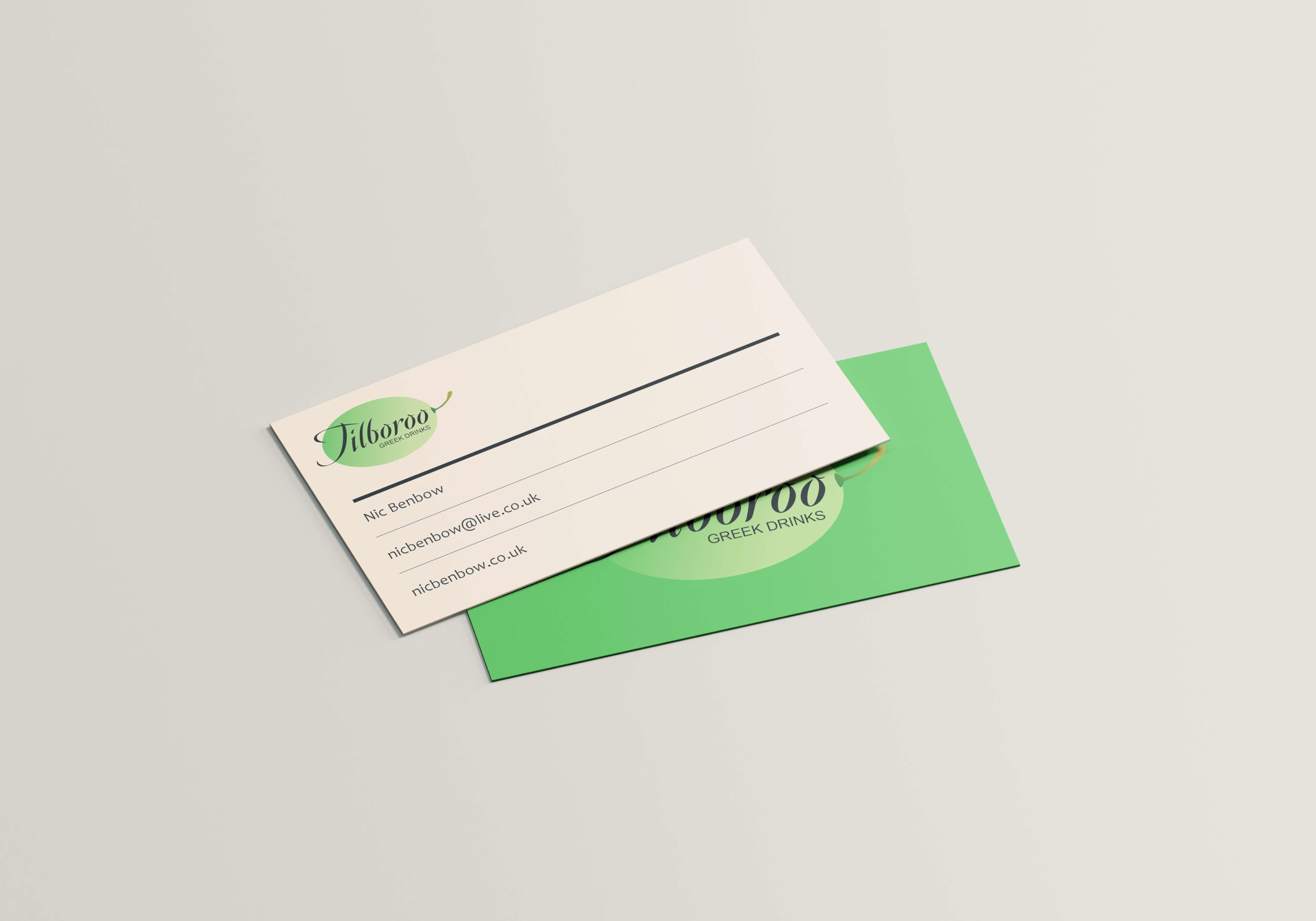
Brand Objectives:
- Awareness
- Importance
- Down To Earth
- Married Couples
- Secret Recipe
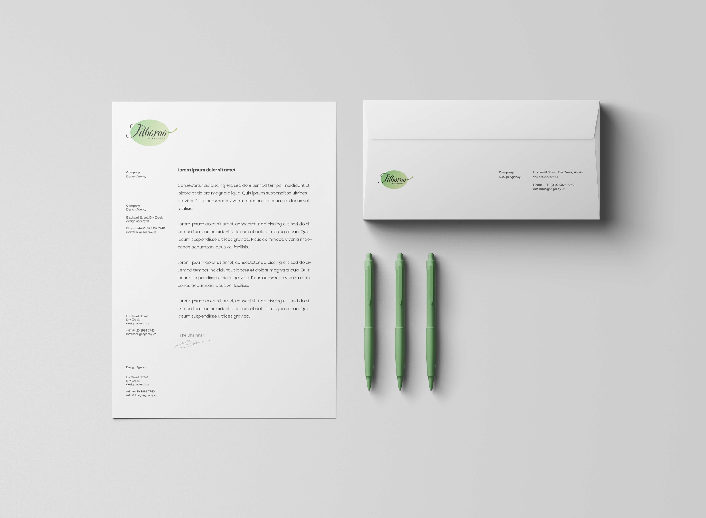
Colour Psychology:
Green - indicates relating to nature and tranquility, which emphasises the company being "down to earth" yet important.
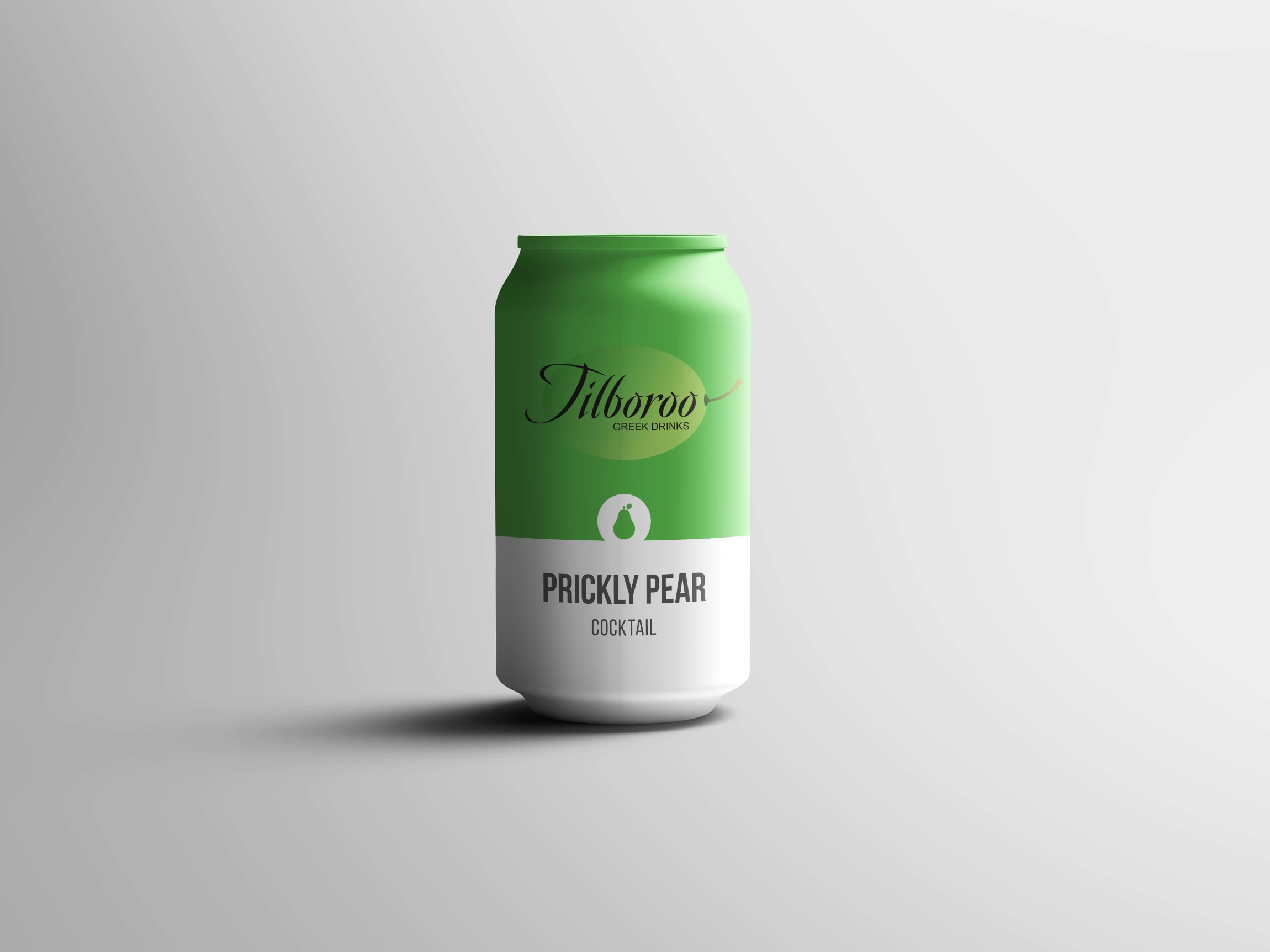
Brand Concept:
The logo was brainstormed using ideas and symbology of Greece. In order to target married coupled I selected a romantic script style font that you might see on a wedding invitation.
- The wordmark, a romantic script style
- Sub-description, a reinforcement of what the company does
- The olive/grape, a symbol of greece, of nature, down to earth
